The Call
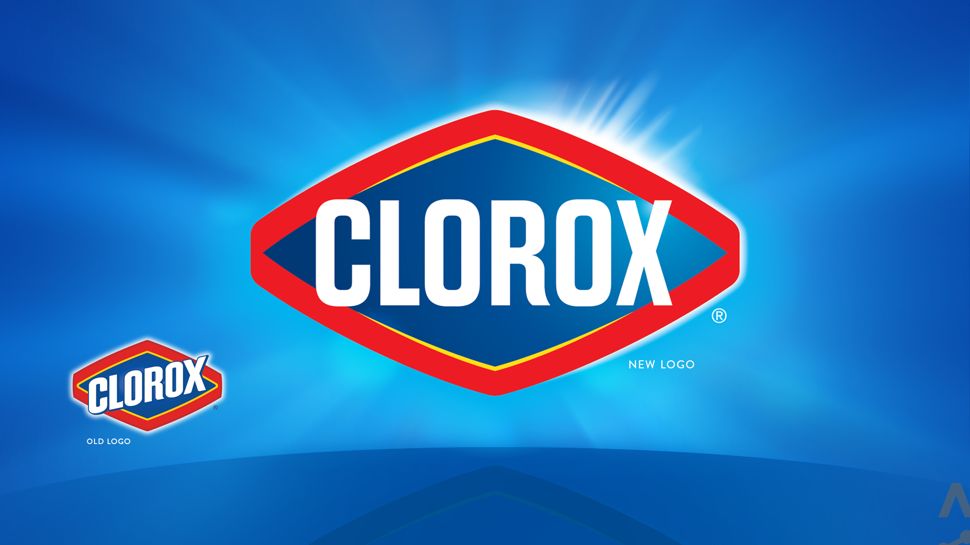
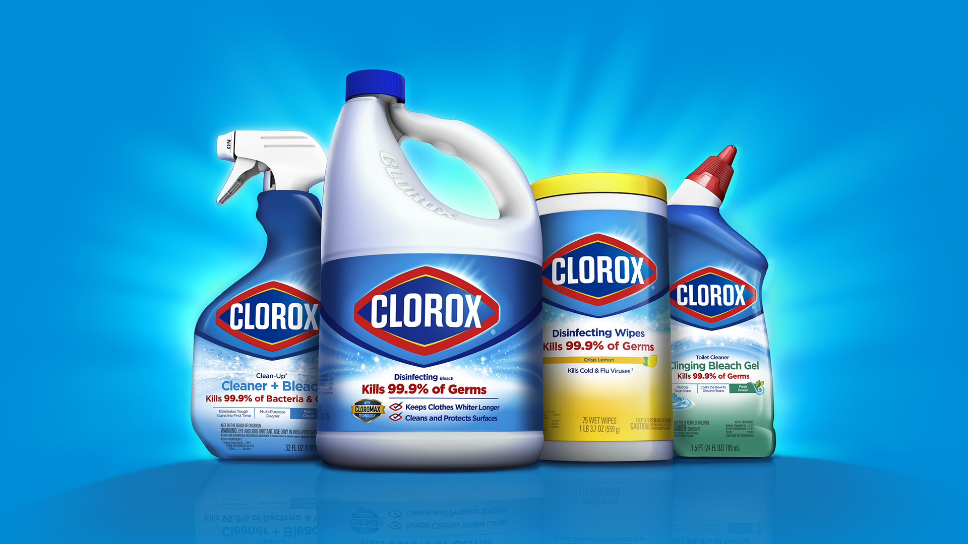
The Clorox brand was becoming a more purpose-driven organization—from “killing germs” to “championing a cleaner world where people thrive.” To enforce this shift, Clorox needed a new identity. Furthermore, the product portfolio became visually inconsistent and didn’t communicate as effectively as it could. New packaging was needed to optimize shelf presence and make products easier to identify and shop.
So how do you update the logo, visual identity, and packaging system of one of the world’s most iconic brands? Carefully. We needed to deliver on a refreshed brand purpose and unify the look and feel of a global product portfolio—all while protecting the equity the Clorox brand had built over more than 100 years of service.
What we did
Global in-market audit
Design strategy
Identity design
Packaging design

The Work
We put the customer at the center of our design exploration. Extensive global research helped us understand each unique market (competing brands, cultures, and consumers) and the value of each equity element (images, colors, shapes, textures, packaging structures, words, taglines, and graphical elements). Decisions were rooted in behaviors supporting the Clorox brand’s new purpose—encourage growth, earn trust every day, think more human.
By designing the feeling of clean, not just a tool to achieve clean, we were able to update the Clorox purpose visually so that consumers “get” what the product is and how it’s used. The new identity and packaging standards have made Clorox-branded products more approachable and easier to shop—helping an iconic brand live a new purpose without losing its history.

The Impact
lorem ipsum dolor emet


