The Call
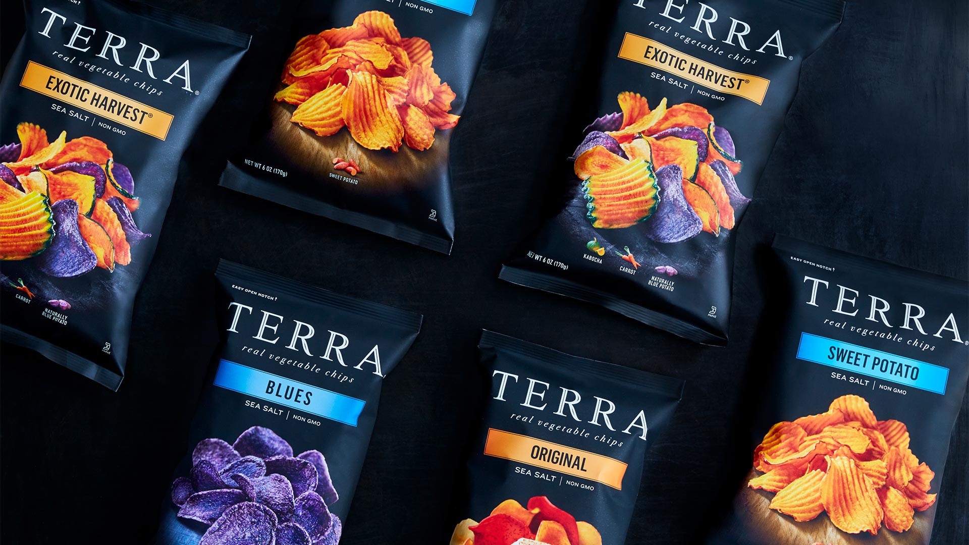
Terra was losing its leadership position in the premium chip category. Initially unique, its packaging design had become ubiquitous. In an increasingly health-and-wellness-conscious environment, Terra needed a refresh to stand out and reassert leadership.
What we did
PURPOSE & MEANING
DESIGN STRATEGY
BRAND ARCHITECTURE
IDENTITY DESIGN
PACKAGING DESIGN
The Work
Terra chips are highly beloved by customers who have a fond relationship with the chips’ vibrant colors and unforgettable taste. We found the brand’s equity rested in its unique origins in nature—sophisticated fans value the distinctive varieties and taste palettes as an elevated choice and an escape from everyday snacks. We translated that insight into strong visuals that speak to the brand’s unique taste and experience.

The Impact
TURNS INCREASED 5% IN THE LAST 6
Senior Management at Hain Celestial
MONTHS ON A BUSINESS THAT HAD BEEN
RELATIVELY FLAT FOR OVER A YEAR.

DESIGN SCORED HIGH WITH
PRS
CONSUMERS QUANTITATIVELY
ON OVERALL APPEAL,
MODERNITY, HEALTH, AND
NAVIGATION AT SHELF.


