The Call
How do you help a heritage brand stand out at shelf and more effectively tell its story in an increasingly crowded category?
What we did
Design Strategy
Brand Architecture
Brand Identity Design
Packaging Design
The Work
A brand equity study showed consumers had positive sentiment for the brand but had little awareness of its distinct and authentic farmer-owned roots.
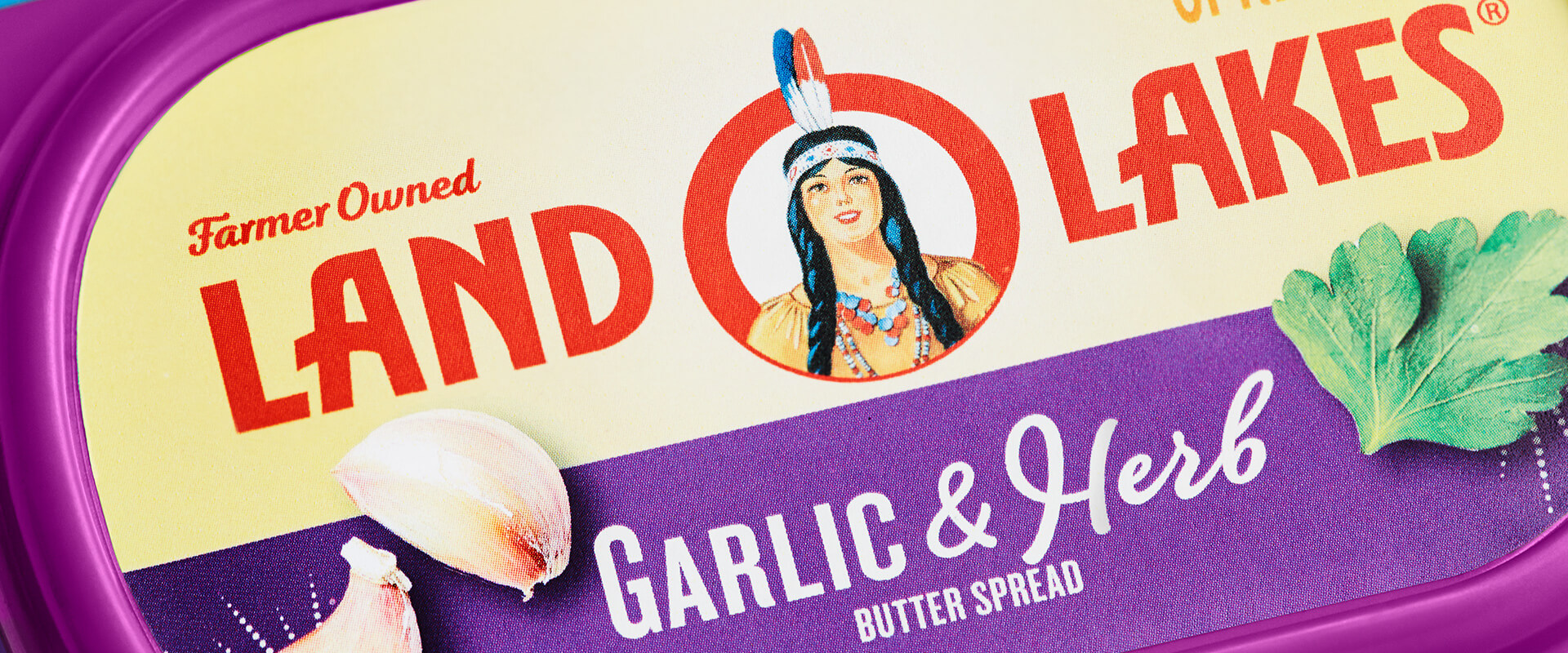
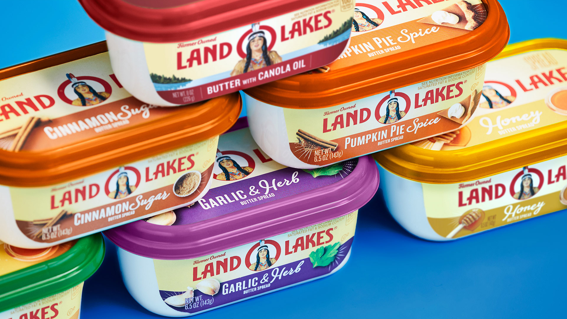
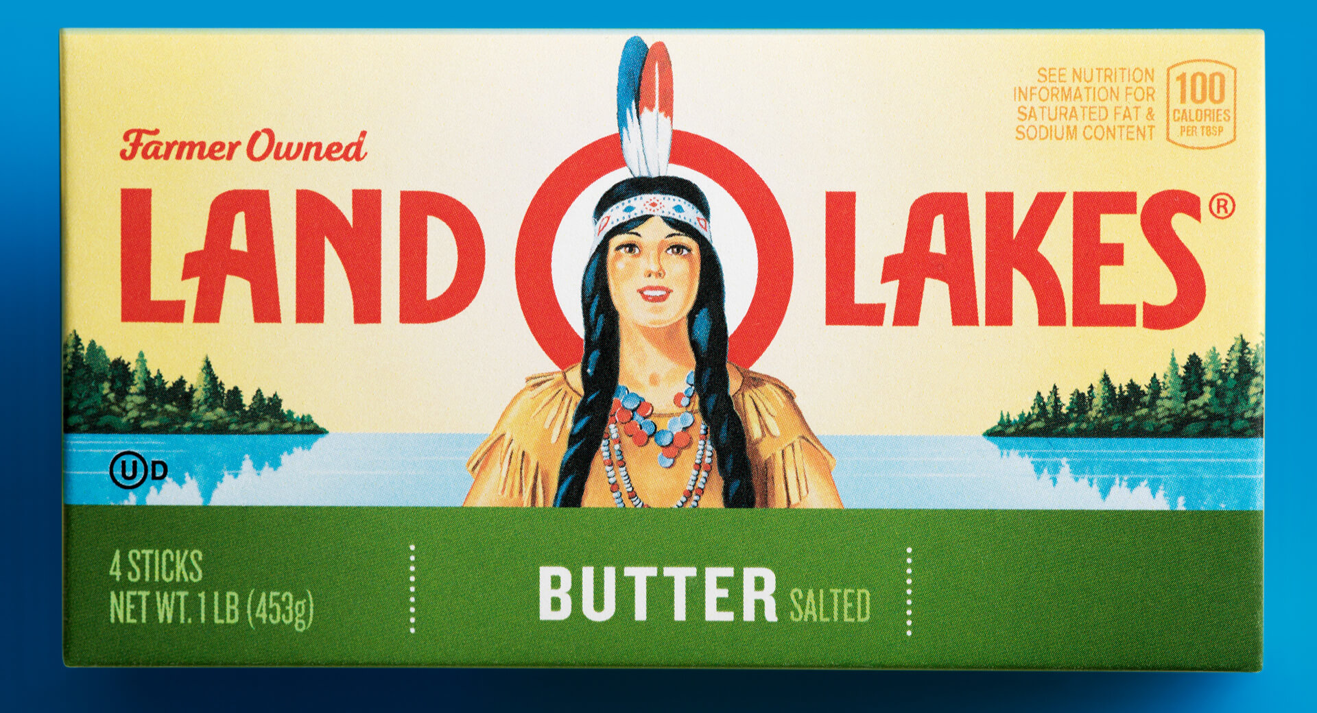
We connected “farmer-owned” directly to the equity of the brand mark on the front of the packing design. We also simplified the brand mark to create a bull’s eye effect, giving it more impact at shelf. More consistent flavor naming and color-coding helped make the flavored spreads easier for consumers to discover and shop.
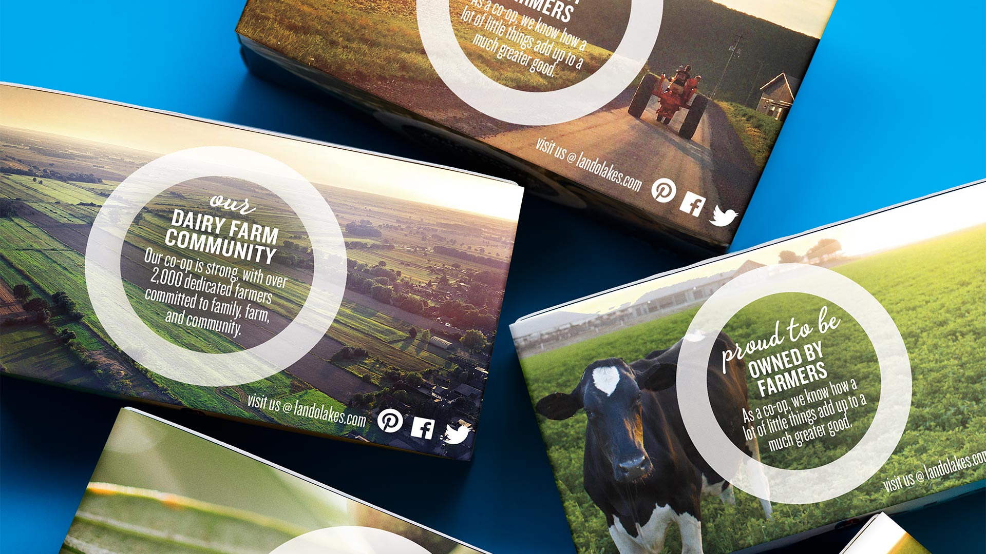
Finally, we used photography of actual Land O’ Lakes farms to tell a more expansive simple goodness story on the back of the packing.
The Impact
- Stronger brand impact at shelf with a more uniform packaging design across products.
- Improved shop-ability through stronger branding and more consistent flavor descriptions.
Top Packing Project
Dieline's Top 50 Packaging Projects of 2018
