The Call
How do you re-stage an iconic cereal brand for a new generation?
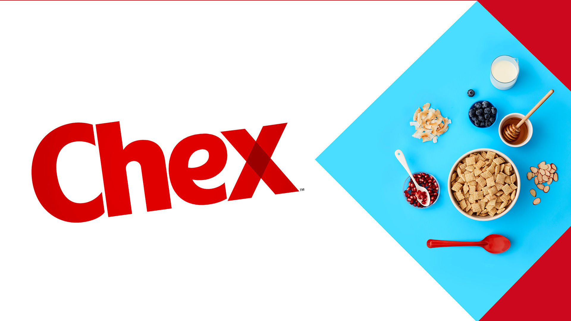
Since its inception in 1937, Chex has been a staple in households across America. Despite its clean, simple ingredients, the brand was beginning to be seen as out of step with consumer expectations around health and wellness.
What we did
Design Strategy
Brand Voice
Identity Design
Packaging Design
The Work
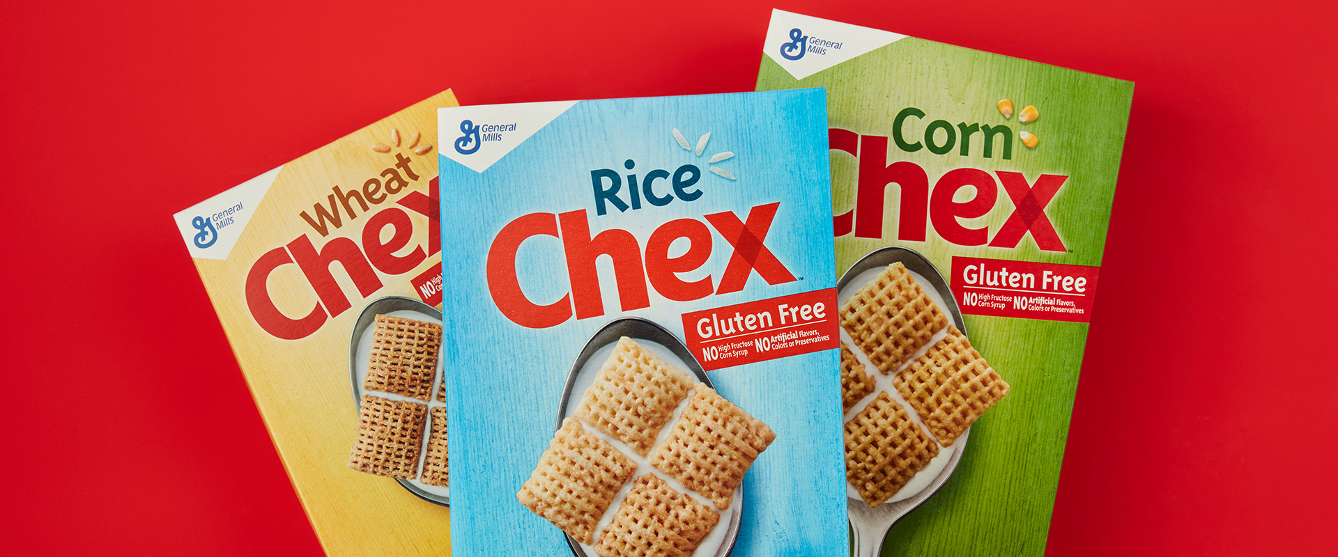
With all of the confusion around brands shouting health claims, Chex had an opportunity to use design to bring forward the simplicity of the brand and its products.
We created a visual system to pay homage to Chex’s iconic square shape. We also simplified the packaging design while introducing new, more meaningful design elements that spoke to the simple wellness of the product. A vibrant color system was introduced, which was seamlessly transferred onto the existing product while also supporting new product innovation.
The design strategy leverages the strongest assets of the master brand to link the Simple Wellness story across the full brand portfolio.
The Impact
- Consumers reported that the new packaging design better expresses the brand’s simple health credentials.
- New packaging design successfully improved breakthrough at shelf, increased taste appeal, and modernized consumer perceptions of the brand.
GOLD TRANSFORM AWARD
PACKAGING, 2017