November 29, 2015
Toss the Tacky, and Other Strategies For Inspiring Holiday Packaging
To create holiday packaging that will enchant consumers, you need to move beyond seasonal clichés and embrace quality design that brings a bit of the unexpected.
With the holidays upon us, celebrations beginning, and an influx of plastic Santas on rooftops, I can’t help but pine for more sophisticated creative this season. It goes without saying that much of the holiday packaging we see is, let’s face it, pretty tacky. It’s as if someone said, “Just slap a reindeer, Santa, or snowflake on the package and call it a day. Oh, and make sure it’s gaudy!” I believe that brands that use cheap tactics are underestimating the public’s ability—and desire—to embrace quality design. Let’s look at some great examples that haven’t used tacky gimmicks to convey “holiday.”
Tissue boxes conjure classic holiday settings
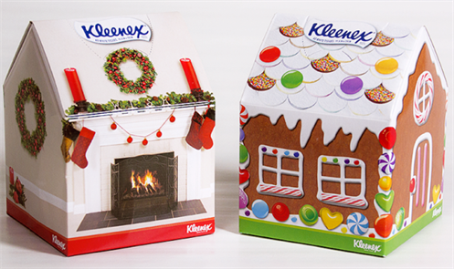
There’s corny Christmas humor—ugly sweater contest anyone?—and then there’s keen Christmas wit. Kleenex opted for the latter when it launched its limited-edition tissue box holiday collection in 2013. Festive enough to leave out on the mantel alongside your stockings for those emotional holiday moments, the holiday tissue boxes were made to resemble quintessential settings like a gingerbread house and garland-draped fireplace. Best of all, the structure of the box was made to look like a roof, with the Kleenex logo at the top. These were tissues you wanted to show off around the house, rather than hide under the Christmas tree.
Socks in a jar reflect handcrafted heritage
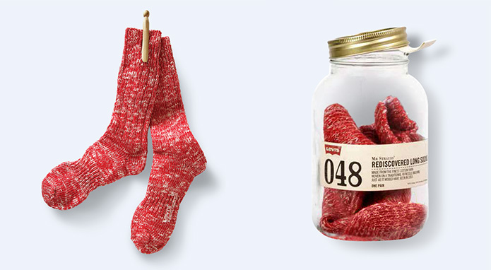
‘Tis the season for cozy socks, as Levi’s knows better than anyone. To its credit, the brand figured out a way to make this classy holiday product more than just a stocking stuffer when it introduced Mr. Strauss’ Rediscovered Long Socks just in time for the 2014 holiday season. The socks are modeled after those worn by the founder of the brand, and claim to be “woven on a traditional 48 needle machine just as it would have been in 1853.” Packaged in a glass jar, with a handmade-style label printed on weathered, antique-style paper, there’s a homegrown feel to the packaging that supports Levi’s handcrafted heritage. As far as the connection to holiday, well, these cozy socks tell the whole story—imagine wearing those red, woolen socks while sitting in front of the fireplace sipping a hot toddy. What’s more holiday than that?
Festive champagne bottle graphics get the party started

Speaking of color, winery Chandon made big news in the libations world in 2014 when it introduced its white-and-gold Limited Edition Party Bottle. No red and green pairings here; Chandon had the confidence to wrap its bottle in all white—reminiscent of a white Christmas—and use a festive gold script that implies celebration and makes the brand really pop (pun intended). Various playful copy lines convey the festivity of the season. The nicely designed, themed bottles make a great holiday gift, and a bottle worth bringing to any party.
Clever copy alludes to season’s treats
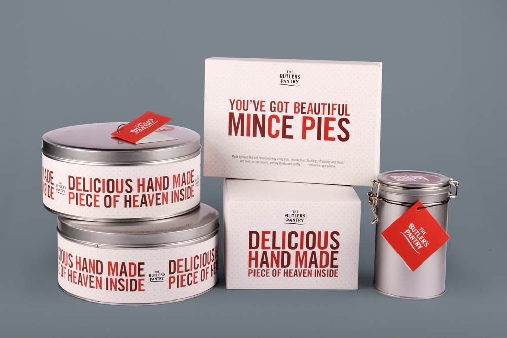
For its line of holiday food products, Irish brand Butler’s Pantry veered away from conventional holiday clichés, and piqued their consumers’ curiosity. A neutral background pattern, made up of mini-snowflakes that hint at the season without overtly referencing it, sets the stage for the festive quotes. Copy such as “You’ve Got Beautiful Mince Pies” and “Delicious Piece of Hand Made Heaven Inside” cleverly alludes to the deliciousness that awaits.
Beer gets gift-wrapped, including a bow
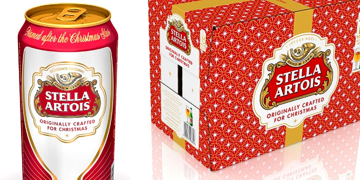
It’s no surprise that Stella Artois—a brand that was actually named for the Christmas star—really embraces the holiday season. Each year, Stella Artois turns out packaging that, while not quite revolutionary, is as understated as it is clever. A few years ago, a festive box was introduced leveraging Stella’s most significant brand assets, the star and the crimson color, staged in a repetitive pattern made to look like gift-wrap. The design covered cases of beer and was tied up with a bow. The perfect gift for any beer drinker on your holiday list—no wrapping required.
Coffee-pack characters celebrate holiday moments

In 2012, Starbucks’ spirited holiday packaging portrayed an unexpected approach to the holiday season. Instead of the usual chubby Santa and happy snowmen, Starbucks opted to illustrate holiday moments with such characters as a Christmas caroler and an ice dancer, which were applied to each of its holiday blends and coffee to-go cups. It made every cup of coffee bring a smile to my face that season.
Faceted glass vodka bottle helps holidays shine brighter

Leave it to Absolut to create the best holiday bottle ever! Reminiscent of a sparkling diamond, the limited edition 2010 Absolut Glimmer bottle made for a shimmering Christmas gift and bar accessory you’d be proud to display at your holiday party. As opposed to other recent holiday bottles such as Absolut Bling Bling, Absolut Disco, and Absolut Rock Edition, Absolut Glimmer marks the first time that the bottle structure was altered, rather than just the graphics. The perfect excuse to shine a little brighter for the holiday.
As all of the examples here prove, beautiful design is indeed always in season. Here are a few pointers to keep in mind:
– Build on your heritage.
– Look for the unexpected.
– Pique your consumer’s curiosity.
– Deliver an engaging experience.
– Emphasize the craft.
So this year I urge you to go beyond the expected clichés of plastic Santas, Rudolphs, and Frostys. Instead, embrace holiday cheer with concepts that engage, entice and remind everyone to be joyful. After all, that’s what this time of year is all about.
Originally published in Packaging World.
Photos courtesy of Kimberly-Clark, Mail Movement, Chandon, The Dieline 1, The Dieline 2, The Dieline 3, and Societ Ricard.
Related Content: The Golden Age Of Packaging
Written by Dustin Longstreth
Dustin is a purpose-driven strategy and marketing leader with extensive experience building high-performance teams, driving growth, and creating brand value. In his role at CBX, He is dedicated to helping clients maximize the cultural and commercial impact of their brands.
Follow Dustin:
