August 24, 2017
Summer 2017 Interns: Introducing nth°
Every summer at CBX, we welcome a talented group of interns to work across our design, strategy and client management departments. Alongside working on client projects, we task our interns with a group project to work on autonomously together. We ask them to combine their individual department expertise and work on the project as if it were a real-life client brief. Our ask: Develop a product and brand experience marketed to the C-suite.
Here’s a recap from the group themselves. Thanks to our class of Summer 2017: Sarah Mitty, Marie Daigle, Megan Brown, Eric Higgins, Darby Philbrick, Lindsey Case, Rachel Bergmann, and Emily Schaefer.
Phase 1: Assessing the ask
As a group that joined CBX eager to learn about as many aspects of branding and design as possible, we were excited about the broad and intriguing ask. Specifically, the opportunity to tackle an all-encompassing brief that would allow each of us to participate in duties beyond our departments. After our initial briefing, we collectively agreed the biggest challenge of the ask was how to market a product to a group we knew very little about. As a group of Millennials, we had few insights about C-suites, and realized our best bet would be to first learn and understand more about this very specific selection of people.
Phase 2: Understanding our target
Our first step was to focus in on our target demographic. In order to create a product that would appeal to them, we needed to understand the attitudes and behaviors of C-suites.
After diving into research about this demographic, we gathered plenty of information on where our target liked to spend their time and income. However, we struggled to find a deeper insight that connected the C-suites on an emotional level. Through brainstorms with our mentors and individual soul searching, we realized the one thing that united them: the desire to accomplish great things through innovation.
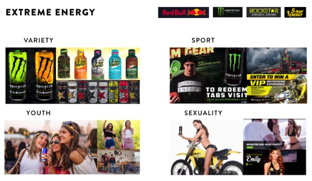
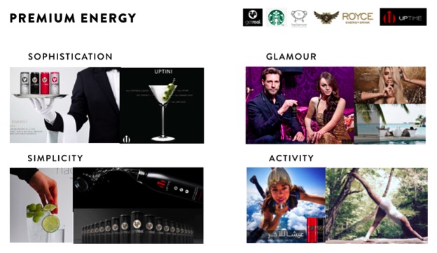
From this insight, we decided to create a product that would help increase mental power, leading us to the energy and nutrition category. We conducted a food and drink audit on various types of energy products from caffeinated ice cream to natural kombucha. Due to the oversaturation of energy foods and general lack of premium coffee replacements, we finally narrowed down our product to be a caffeinated energy drink. We divided the energy drink category into two audits: extreme (e.g. Red Bull, Moster) versus premium (e.g. Hackamore, Uptime). From these audits, we identified visual and verbal tonality and key messages that were working successfully and also took note of category generalizations to avoid.
Phase 3: Strategy
Once we finally decided on the energy drink category, we tackled strategy. We began with examining the white space in the category in combination with our target consumers to figure out how we could successfully position ourselves as a brand new option.
One strategic direction emerged: Positioning ourselves as a mental energy drink rather than promoting physical energy. From our competitive audits of both the extreme and premium energy categories, we identified that most other brands highlight physical energy, using sports imagery and messaging promoting motion and activity. Since our target consisted of high-aptitude people, we recognized the need for a drink that focused on mental energy. However, our challenge was to convince these A-type people who most likely believed they were already superior in their mental capabilities, that they needed more.
This led to our belief and purpose statement in communicating that the brain has an entire realm of untapped creative potential and our product would help facilitate the connection. We created the name, “nth°”, emphasizing uncapped energy and creativity. This strategy allowed us to focus on the science of the mind and potential for world-changing innovation as we entered the design phase.

Phase 4: Design
Initially, we designed two different concepts, “Down to a Science,” which focused on the world of untapped scientific brain power and “Mindful Minimalism,” which focused on sleek, straightforward intelligence. Our original sketches and renderings had a wide range of interpretations, with everything from intelligent symbols like light bulbs to fierce animals to creative patterns. Ultimately, we decided on Mindful Minimalism[SM1] , because it was unique to the category while still appealing to the C-suite consumer.

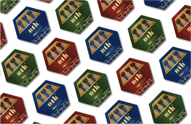
Our final design was a perfect combination of all our ideas. From the structure to the degree sign, nth° owns the hexagon, which symbolizes an energy molecule. Much like our C-suite consumer, the front of the pack was clean and sleek. The flood of pattern that appears on the inside represents their creativity and innovation. The hexagonal pattern is infinite, conveying the limitless potential of the mind. The colors were inspired by premium whiskey packaging and the pop of gold gives the package an elite accent. Our copy is motivational, smart and confident , reflecting our brand personality.

Phase 5: Brand Activation
For the brand activation, we wanted to create a physical experience that reflected our brand values of innovation and intelligence while also making something that C-suites would take time out of their day to engage with.
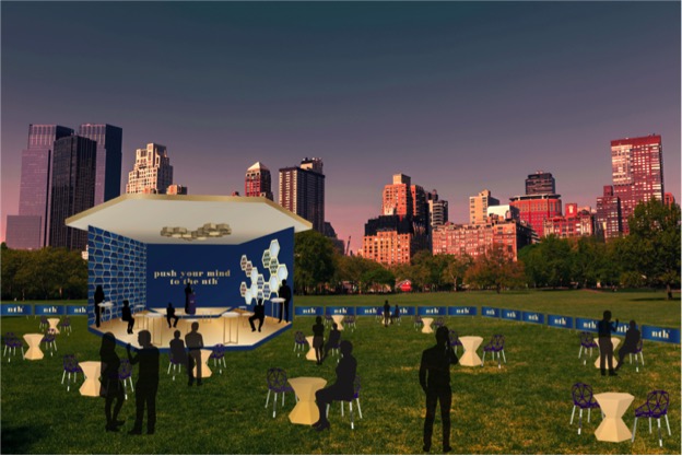
To promote the idea of extraordinary innovation, we decided on creating the “nth° tour,” which would bring some of the world’s top innovators to speak at an event taking place in a unique hexagonal structure resembling our packaging. The top agencies in the area would be invited to the event, promoting an exclusive atmosphere that would be attractive to C-suites. The event would also feature free samples of our product and opportunity for the attendees to network and share ideas.
Written by CBX Strategy
