September 26, 2016
Pentawards Announces 2016 Packaging Design Winners
The international jury of Pentawards®, the first worldwide competition devoted exclusively to Packaging Design, chaired by Gérard Caron, is announcing its 2016 winners.
This year, which celebrates the 10th anniversary of the Pentawards, the winners received the following global awards in Shanghai’s design hotel Hyatt on the Bund in front of more than 250 designers and brand owners from all around the world (24 countries represented).
PENTAWARDS 2016:
5 Platinum Pentawards, the Best in each Category
Besides the Diamond Pentaward, the best of the show (Domino’s Pizza) the international jury chaired by Gérard Caron also awarded the 5 “Best of the Category” prizes.
The BEVERAGES Platinum
…went to the superb bottle of Imayotsukasa Sake created by Bullet agency (Japan)

This special sake is named after the carp, a famous ornamental fish and a symbol of Japan, which has been bred for decades in the same Niigata prefecture where this Nishikigoi sake is manufactured. Considered a living jewel, the carp has beautiful red patterns on a white body and this scheme has been adopted in the bottle design where the red is printed directly on to the white bottle. Japanese brush-work was used to create the red elements, while the outer box features a window in the shape of a fish. The combining of white, red and gold gives a luxurious impression and makes it an excellent gift, while the packaging helps Nishikigoi stand out from other sake brands in the Japanese and overseas markets.
The FOOD Platinum
…was won by CBX (USA) for the packaging of meat from Man Cave Meats.

The founders of Man Cave Craft Meats, Nick and Josh Beste, were university students when they launched their business, by crafting innovative flavor combos with an obsessive focus on quality. Moving from the stall at the Minneapolis Farmers Market out into grocery stores required the creation of a punchy packaging design for Man Cave Craft Meats to proclaim the makers’ innovative flavor combinations and obsessive pursuit of quality. This was a product with a bold and authentic identity, and a strong measure of individuality, reminiscent of the artisanal world of craft beer with its small-batch production and straightforward, masculine irreverence. So for the unpretentious foodie core customer, the new design uses hand-crafted typography on a strong black background, and images of burly, bearded men with tattoos, alongside taglines such as: “Long live the butcher!”
The BODY Platinum
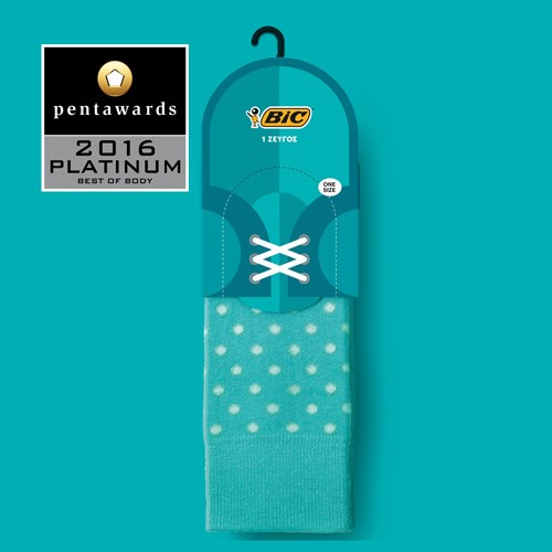
…is awarded to Mousegraphics (Greece) for a series of packaging for the BIC brand socks.

BIC is a company with a strong brand known worldwide. A fresh packaging idea here brings a number of Bic products together by the use of a smart but simple concept and its variations: if socks dress the feet, shoes complete the process, then socks for sale on the shelf can also be ‘dressed’ in shoes in a playful manner that catches the eye immediately. The packaging for each style features the image of a type of shoe (women’s, men’s, sports, casual) to match the sock. Within the brand’s range this creates a discrete category that is easy to identify (shoes) while also providing a unifying principle.
The OTHER MARKETS Platinum
…is awarded to The Partners (UK) for a range of packaging designs for Argos ‘Simple Value’ household appliances.

Argos is the UK’s leading digital retailer – 33,000 products 53,000 lines, 130 million customers, 840 UK stores. Consisting of 140 basic household items, the Argos ‘Simple Value’ range offers solid quality at low prices. It was this combination of simplicity with value that led to the name, and the packaging also reflects the fact that these products speak for themselves. But simple need not mean dull, and while the product descriptions communicate the basic values there are unexpected twists that lift the copy into something that engages more personally with customers. Different designs have also been created for all these items, and with several hundred thousand units produced per year the simplicity of the print production makes it easier for international suppliers to contribute to the range..
The LUXURY Platinum
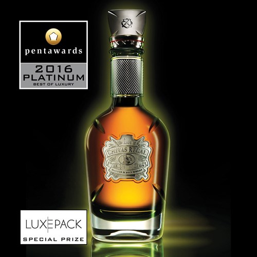
…goes to Coley Porter Bell (United Kingdom) for the luxurious Chivas Regal bottle, The Icon, and its superb packaging.

Chivas Regal is considered the world’s first luxury whisky. It was the first Scotch to be exported to the rest of the world in 1909 and became the iconic whisky of its time, drunk by the global elite. Fast forward just over one hundred years and Coley Porter Bell were tasked with developing the positioning, visual identity and packaging for a new ultra-prestige product that would serve to enhance Chivas Regal’s luxury credentials. As a permanent expression representing the pinnacle of the range (retailing at US$3,500), their challenge was to get to the very essence of the brand’s visual DNA. To deconstruct its qualities and re-imagine them in the purest, most sublime form. They needed to look backwards in order to look forwards and in doing so, they struck upon their inspiration – the original 1909 bottle – an icon of its day. The design pays tribute to the brand’s illustrious past – the green crystal decanter in particular, but also the touches of red throughout the packaging, the reference to the ship on the badge and the presentation case pay homage to the iconic green bottle of 1909 and the brand’s export story. The agency worked closely with a leading luxury cabinet-maker and the master craftsmen at Dartington Crystal. Each decanter is mouth-blown and hand finished.
Read the full article in Brand Packaging
Photos Courtesy of the Pentawards
Written by Dustin Longstreth
Dustin is a purpose-driven strategy and marketing leader with extensive experience building high-performance teams, driving growth, and creating brand value. In his role at CBX, He is dedicated to helping clients maximize the cultural and commercial impact of their brands.
Follow Dustin:


